

Using The BMoC Dashboard
About the BMoC Dashboard
The BMoC Dashboard is a new interactive and customizable tool offering localized and timely data on the wellbeing of boys and men of color in California. Dashboard indicators present accessible data that can be analyzed by geography, time, and race/ethnicity. New indicators will continue to be added to the tool, expanding its usability to paint a full picture of boys and men of color in the state.
Navigating Dashboard
Each dashboard indicator presents data from a publicly available source that has been prepared and framed for analysis on the wellbeing of boys and men of color. The data that is displayed comes from a variety of sources and is presented with different filtering options.
Each indicator is presented in three different views: population, trends, and maps. Each of these views allows for unique analysis that can be further customized. To navigate between the different views, click on each tab at the top of the dashboard.

The population view allows you to look at the individual indicator by race and ethnicity in a given year for a specific locality. This view is useful for comparing groups. For example, one could compare the percentage of Black students meeting the UC/CSU course requirements (college readiness rates) with all students, or another specific group.
Hovering over a bar will present additional information in a pop-up text box. This feature works across all three views of each dashboard.

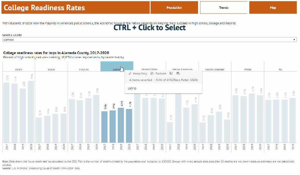
The trends view shows the data for a given indicator across time, organized by racial/ethnic group.
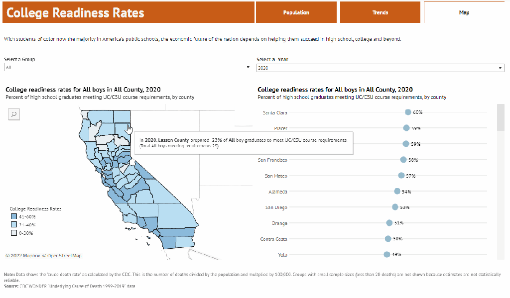
The map view allows you to look at the data mapped across California. The left panel shows data mapped, and the right panel shows this data ranked from highest to lowest. Clicking on a specific county in the map will highlight the data in the ranked chart, and vice versa.
Customizing Data
Each indicator allows you to customize the data across a variety of parameters. Each indicator will have different parameters for filtering and sorting, but broadly, you can customize each indicator to show data for a particular county, year, or age group.
In the example below, data is filtered to specific counties by using the ‘Select a County’ filter located at the top of the population bars. Once a county is selected, the display is automatically updated. (For certain indicators, not all groups may be shown for a specific geography/year given data constraints. See that indicator’s notes and methodology for more information).
Multiple filters can be applied at the same time, allowing you to customize charts for specific county + year combinations, for example. Filters will be applied to all views in the dashboard (i.e. a filter applied in ‘population’ will be applied in the ‘trends’ view).

Charts can also be customized to show only specific groups. This works for both the population and trends view. This is helpful in cases where you wish to highlight certain groups within an indicator.
To do this, hold the CTRL key and select specific groups. These will be highlighted. Press Keep Only to keep only those groups in the current chart view.
If you have any feedback or questions about the BMoC Dashboard, please email info@abmoc.org
Exporting Data & Views
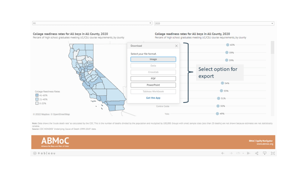
Data from an indicator can be exported, and charts can be downloaded as images or PDFs to include in your own presentations or documents. Navigate to the bottom of each dashboard and click Download to export each view into an image, PDF, or PowerPoint file.

A menu will appear that allows you to choose the type of file you wish to export.
If you have any feedback or questions about the BMoC Dashboard, please email info@abmoc.org